


Public Transit Meets Southern Hospitality
Yonder is a concept app design and landing page that embraces public transit options to people in the southern United States. While other transit apps cater specifically towards larger cities in the East Coast and California, Yonder finds and offers public transportation options to anyone in the South without having to deal with their outdated local department of transportation websites.
The design behind Yonder is driven by the idea of fast movement along with cultural ties back to the South. Public Transportation doesn't have to feel like a personal sacrifice to save the environment, and Yonder aims to do just that by redefining the convenience and experience of public transit. The brand and interface features a selection of illustrations by Pablo Stanley along with a smooth user flow that speaks to the potential of group travel. Combining the southern feel of warm colors and script lettering with the innovative pace of web animation and user-friendly app design, Yonder is bringing southern hospitality to public transit.
Client
+ Yonder
Scope
+ UI/UX
+ Web
+ Interaction
+ Branding
+ Custom Type
+ Messaging
Duration
January 5-25, 2022 (3 weeks)

The logo suite and app icon were made to feel swift and
fast-flowing like public transit while also tying back to classic script lettering and slab serifs that are so central to the South.
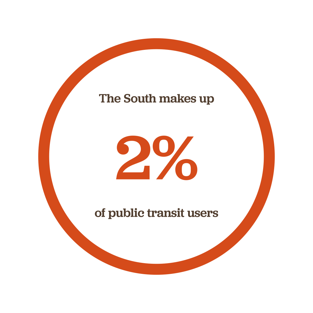
Public transportation in the southern United States is generally viewed as a last resort or secondary option to cars- yonder would change that.


The Goal:
Encourage Southerners to use Public Transit
-
Make public transit options accessible
-
Gather all options on a singular platform
-
Provide fast and current transit options to desired destinations

The Landing Page:
A First Impression
First impressions are a big deal for Southerners, and Yonder came to impress. With animated scroll features and relevant photography of southern roads, the Yonder landing page instantly associates the idea of movement and home with the brand and gets the user ready to get moving the new-fashioned way.
Check out the full web prototype here.


Key Screens
Explore some of the key screens that showcases the minimal and simple user flow behind Yonder.


Designing Beyond the App
Yonder extends beyond the mobile experience. Along with the app interface, Yonder offers sufficient feedback and memory-recall triggers through an extensive notification system to remind users about their upcoming arrivals, departures, and more. Beyond the screen, Yonder would also dive into branded environmental graphics to create a recognition pattern between the app and the real world while also helping direct users to where they need to be to unify Southern public transportation under a singular brand and mission.


Driving Change with Yonder.
As a designer, I'm always aiming to design for change, growth, and discovery. While Yonder may only live in concept, I think the general experience can make us all realize the potential for changing, growing, and rediscovering the public transit system and its effect on how we protect our environment. Yonder is just another example of design for people by people. Understanding and analyzing people's perspectives can lead us to find improvements and exceed expectations most people would never think were possible within existing systems. But most of all, this level of understanding and empathy towards people shows us how innovation and a world of redefined possibilities is waiting for us just over yonder.
If you liked that, you'd love this
